Interior Lighting and Color Psychology
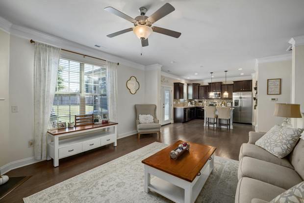
The lighting of our homes and offices is perhaps one of the most important, and yet one of the least thought-about, design decisions. The way a room is lit sets the mood and performance of a person. If you are not comfortable in a space, it will directly affect your productivity. Interior lighting and color psychology play an important role in shaping how a room feels and functions. Lighting in a given space could be decorative, functional, focused, or ambient. Each light has its own importance and defines the room in a special way.
Types of Interior Lighting and Their Practical Uses
Different lights have different color effects and utilities. For example, incandescent lights give a yellow tinge, and halogen bulbs have a bluish-white effect. You can use halogen bulbs for reading because they provide clear light, although they are now less energy-efficient than LED lighting. Fluorescent bulbs can be used for indirect lighting, last much longer than regular bulbs, and save energy. Incandescent lights are effective for everyday needs and dimming effects. It is a traditional form of lighting and was once among the least expensive options. Here are a few suggestions on how you can light up your spaces in the most efficient manner.
Use Different Lights for Better Comfort and Function
It is not always best to have uniform lights for the complete space. Especially in the areas where we need to work or read, uniform light can be a distraction to our eyes. For such areas, a focused light or lamp can be a good choice. You might need to highlight a particular area of the home or office and can consider having a spotlight for those special areas. You can have task lights for your kitchen and ambient light for your reception and entertainment spaces. Use a combination of lights to get the best result and utility.
Layered Lighting for Flexible and Attractive Interiors
You can have various lights in a single space and create effects by placing lights of different intensity at different angles. This will create a dramatic and attractive effect for any space. You might not want to light up all fixtures at one time and use them as per your moods and needs.
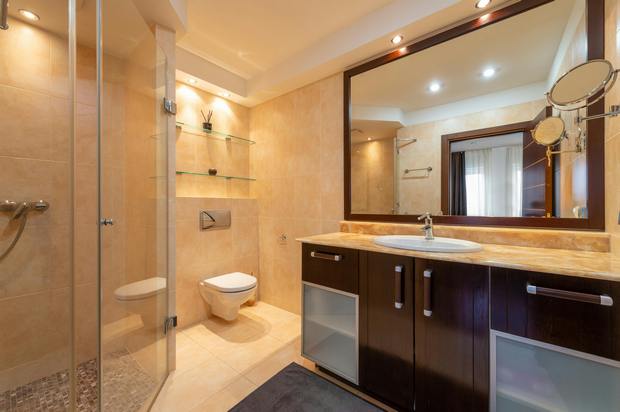
Wall Lighting Ideas to Reduce Eye Strain
If you work on your computer for long durations and the area around the screen is not well lit, it might strain your eyes, as there is a contrast between the bright screen and the dark room. Try using a recessed wall washer in such cases on the wall behind your computer screen. This is a light fixture that looks like a regular light and projects light down the wall, but the optics, or reflectors, inside are designed to spread light out to the side instead of having it shoot straight down.
How to Avoid Glare in Interior Spaces
If you are not looking for a glamorous or dramatic effect in the room, select the finish of the horizontal surfaces carefully. A glossy or metallic finish surface can reflect the light and create glare. A matte finish is usually better if you want to avoid glare.
Psychological Effects of Colors in Interior Design
Color plays a vital role in the creation of mood and feelings. The psychological effects of various colors like white, gray, blue, orange, and others are explained in the following sections.
White in Interior Design: Clean, Bright, and Spacious
White—the psychological impact of the color white is not the same around the globe. Different cultures associate very different feelings, moods, meanings, and psychological effects with this color. For example, if you grew up in a Western society, you will probably see white as a clean, pristine color and think of weddings, clouds, fresh snow, spring blossoms, and similar pleasant things. On the other hand, if you are from parts of China or Japan, where white is the traditional color of death and mourning, the psychological effects would be quite different, and you might prefer to have as little white as possible around your home.
Whereas, if you live in Northern India, you are likely to paint your walls white, while your traditional wedding colors will likely be glorious red and gold. So it is not all pretty and angelic around the world.
Interior design in Western societies uses the color white to create an airy, pure, clear, and serene feel for a home. On floors, walls, and furniture, the color white can make a room feel larger than it is and add a crisp freshness to an interior design scheme. To take advantage of the psychological effects of the color white, you do not always need a lot of it. Just accents, for example window and door frames painted in white, cream, or ivory, can lift the look and feel of a whole room.
On its own, pure brilliant white can look sterile or high-maintenance, particularly with very sleek interior design styles that involve lots of polished surfaces. To soften the look of a room, the secret is to layer up tints, from chalky white to ivory, and textures in walls, textiles, and floor coverings. This will help make a white room warmer and more inviting, both psychologically and physically.
If you do not want a lot of color around you but are not too keen on all-white environments either, you can always enjoy the psychological impact of white color in combination with other neutrals.
Gray in Interiors: Calm, Elegant, and Modern
Gray—many people think of gray as a safe color, but that is not always true. With gray, it is possible to create either brilliant or truly poor interiors.
Let us start with the good side. Used well, the color gray can lend interiors an elegant formality that is subtle without being overly conservative. It is the color if you want to create an air of calm and understated confidence. For gray to have this psychological impact, it is best combined with whites and other neutrals.
But you need not stop there. Gray can be a wonderful background color for other, more intense colors. If you get the right shade of gray and mix it into a more adventurous room color scheme, it will make the other colors stand out. Apart from its psychological effects, gray also has a practical quality that makes it useful for adjusting paint colors. If you are decorating with ready-mixed paints, a bit of gray can take the synthetic edge off.
On the other hand, the color gray often contains other colors. You can get the whole range from yellowish to orangey-brownish to purplish, bluish, and greenish grays, and their psychological effects can be quite different, particularly when you use them over large areas.
For example, a yellowish, murky-looking version of gray can look quite depressing, especially if you paint more than one wall with it and combine it with brown hues in a room. But a really neutral hue of gray, that is, a gray that has no color in it apart from clean white and black, will tend to look clean and crisp in most color combinations.
The danger with gray is that if you have this color on too many surfaces, with no other color or a clean white to brighten it up, gray will be overpowering and you will end up in a dull, moody environment. But throw in some whites or more intense colors and gray will become a chic, sophisticated canvas for your life.
Black in Interior Design: Bold, Sophisticated, and Powerful
The color black can lend an air of sophistication and elegance to an interior design scheme. Against a background of lighter colors or neutrals, anything in black will stand out. The color black provides bold and defined detail, like print on a page.
For this reason, the color black is great if you want to draw attention to fine features of a room, furniture with good structure, or ornamental detail. If, on the other hand, you have fallen in love with a big black sofa and your living room is a bit on the small side, the psychological effects of the color black will work against you. This color can really smother a room and give it a severe austerity.
In the West, the color black is often used to demonstrate power and social prestige, but you will not find much that is actually joyful or life-affirming about this color. Black is associated with death, mourning, widowhood, and generally serious and formal occasions. It even absorbs light—all the other colors reflect light to some extent, but black absorbs it.
Use the color wisely, like eyeliner for a room, on details like picture frames, accessories, small side tables, piping or similar detail in textiles, or as an element of patterns. If you use black in small doses, its main psychological effect will be to underline your home’s chic sophistication.
Soft blacks can reduce the psychological impact of stark black. You can use near-black neutrals like charcoal, deep blue, deep purple, very dark green, or dark coffee brown. All these carry visual weight, but without the severity of pure black.
Brown in Interiors: Warm, Natural, and Grounding
Brown can be quite a comforting color. Think of chocolate, coffee, and cookies. Nature, too, is full of the color brown; in most parts of the world, brown is the color of the earth, and most plants have at least some brown in them.
This is why the psychological effects of the color brown are often described as reassuring, safe, and stabilizing. In an interior design scheme, the color brown can add warmth and depth. It can bring earthiness into a cool or neutral color combination and make it more welcoming.
Obviously, the psychological effects of the color brown vary with its shades and tints. Brown is a color you want to use wisely. Natural browns—wood, wicker, straw, stone, and earth pigments—are almost always attractive, but synthetic browns can occasionally come across as one-dimensional and unpleasant.
Also, the color brown can support very different styles, depending on the materials that carry the color. Chic, beautifully finished wooden furniture and floors in natural hues can look very sophisticated. On the other hand, raw untreated wood and woolen textiles in natural shades of brown will have a more rustic effect.
Apart from wood and natural fibers, baked clay can add beautiful shades of the color brown to your home: terracotta, raw umber, burnt umber, sienna red, yellow ochre, and red ochre. All these are earth colors that have been used for thousands of years and can be a source of rich, organic, warming interiors.
Orange Color in Interior: Energetic, Warm, and Inviting
The color orange is generally experienced as the warmest color. Between yellow and red on the color wheel, the psychological effects of the color orange seem to combine those of red and yellow. Orange is a sensuous color. It is perceived as emotionally stimulating, energetic, vibrant, and fun.
Saturated orange attracts attention, and it also stimulates appetite, similarly to the color red, and is therefore often used in advertising, kitchens, and restaurants. Interestingly, the color orange also has a spiritual connection; it is a holy color in India and Nepal.
As with other colors, the effect of the color orange depends on its hue, its tint, or its shade. Orange is most powerful when it is not lightened, darkened, or dulled too much through mixing with other colors. By the same token, the psychological effects of the color orange are much gentler in its pastel and earthy shades.
So if you do not want a strong color impact in your home, shades or tints of the color orange will work much better for you. If you love Mediterranean-style living, consider using different shades of terracotta in your home. These hues evoke the warmth and richness of country living in Italy, Spain, and Provence.
Red in Interiors: Powerful, Stimulating, and Attention-Grabbing
The psychological effects of the color red are very easy to notice—red is an extremely powerful color. Since blood is red, regardless of race or country, the color red often signals danger. Fire is red, and so are many stop signs and warning signals.
A red environment is said to raise our levels of passion. Red is a very immediate color; it appears closer than it is. Psychologically, a room with red walls will close in on you.
Along with the color orange, red is a favorite with the food-packaging industry and with restaurants because it is said to enhance appetite. Therefore, interior design professionals sometimes suggest using it for dining room walls.
As with other colors, the psychological effects of the color red depend very much on its intensity. While vibrant, saturated hues of red may feel overstimulating, many people feel quite comfortable with muted, warm, earthy shades of red around them, for example red ochre, Venetian red, brick red, or terracotta. That is the type of red where you get warmth, comfort, and energy, but with none of the exaggerated intensity.
Pink Color in Interior Design: Soft, Comforting, and Stylish
The color pink is a tint of the color red, also called a pastel, a color that has been mixed with white and thereby softened. In most Western countries, the color pink is seen as a feminine color and heavily used for anything to do with baby girls. But this has not always been the case. A century ago, pink was considered by some to be stronger and more suitable for boys than blue. So the concept of pink as a girly color is not fixed.
In Europe, refined and sophisticated versions of the color pink have been used in interior design for centuries by both men and women. Generally, when used in interior design, the psychological effect of the color pink is described as soothing and comforting.
In some educational and healthcare spaces, interior walls have been color-washed in warm, gentle hues of the color pink because of these calming qualities. Pink can also have a sweetness and freshness about it that many people find attractive. Just like red, pink comes in many hues. Peach pink, bubble-gum pink, and brighter pinks each have their own appeal and psychological effects.
Pink has also been used in attempts to influence mood in sports spaces, although the success of such color schemes has been mixed. In interiors, the effect of pink depends greatly on the chosen shade and how it is balanced with other colors.
Purple in Interiors: Luxurious, Rich, and Dramatic
Use the psychological effects of the color purple to create a rich, luxurious feel for your home. Purple is the color of kings. The psychological effects of the color purple depend very much on how warm or cool the hue is.
Bluish purples can be serene and calming and have a mysterious depth. Reddish purples demand more attention and can dominate a room. Some of the psychological effects of the color purple may have to do with its history.
In the West, purple has a long-standing reputation as the color of royalty and power. For centuries, the intended psychological effect of the color purple was to show that the wearer was important. This was partly because purple dye was once so expensive that only very rich people could afford it.
Much later, synthetic dye made the color purple more widely available in dress and interior design. Apart from being fashionable, purple also had religious and ceremonial associations. Purple is a rich, deeply satisfying, complex color that can add real luxury to a room.
Blue in Interior Design: Cool, Calm, and Expansive
Use the psychological effects of the color blue to create a cool, serene feel for your home. In interior decorating, you can use the color blue to create a reflective, intellectual atmosphere. It is not easy to overheat emotionally and get upset or aggressive in a cool environment.
The see-through quality of air makes the blue color of the sky look distant. This psychological effect of the color blue is used in interior design to expand the walls of a room by painting them in light shades of blue. It does not work in the same way with dark blues.
You can also use the color blue to cool down a hot, sunny room. Obviously, blue does not actually lower the temperature, but it makes us feel cooler. The reverse is true when you are decorating a north-facing room. Blue walls, flooring, or furniture can give it a distinctly cold feel.
In Western countries, blue is generally accepted as the color for baby boys’ clothing and nurseries, although this idea has changed over time. Blue has also sometimes been linked with reduced appetite, so some people consider using it in kitchens or dining rooms.
Like purple, the color blue has royal connections and was once very expensive to obtain. Indigo, a vegetable dye, can produce deep, rich, and subtle hues of blue and has been used in African, Asian, and European cultures for centuries. If you want to use the psychological effects of blue to create a meditative or spiritual environment, indigo is a very good choice.
Green in Interiors: Relaxing, Fresh, and Nature-Inspired
Use the psychological effects of the color green to create a gentle, relaxed feel for your home. On a basic psychological level, the color green tells us that we are safe. In a fertile, water-rich environment, there is enough to eat and we can relax.
Green is very easy on the eye, and nature keeps us surrounded with an abundance of green hues, tints, and shades. However, using the color green in interior design is a bit of a challenge. Green is one color that can really go wrong on walls and fabrics.
This may be because the natural greens around us are never just one color. Even a small blade of grass contains several hues of green. So, if you can see trees and lawns from the window, a solid green wall color might look a bit artificial by comparison.
One way to use the color green in interior design is to combine different hues of it, or combine green with other colors. Sage, gray, pink, and magenta go well together. Or, you could combine greens with neutrals and blues for a coastal look.
You could also try mixing a tiny bit of the complementary color, red, into your green paint. That softens it slightly and adds complexity and depth. Alternatively, you could tint it with white or light gray, or adjust it with some yellow or blue. These are all ways to use the psychological effects of the color green while avoiding decorating problems.
Lighting influences any color in interior design, and colors change their personality under different lights. So it is really important that you test any green paint thoroughly in every possible daylight situation and under artificial lighting.
Yellow in Interior Design: Bright, Cheerful, and Uplifting
Use the psychological effects of the color yellow to create a bright, optimistic feel for your home. Yellow is often described as an optimistic, life-affirming color that reminds us of sunshine and stimulates the mind, body, and emotions. Some people also find that it helps them with concentration.
The effect of the color yellow obviously varies with its intensity and hue. A pale tint of yellow on walls or ceilings can add sunshine to a room, while saturated, intense yellows might make you feel uncomfortable after a while.
Because opinions about this color are so divided, you should not worry too much about how the color yellow affects others unless you share a home with them. Your personal response to yellow will help you get the most out of this color. You may not necessarily want it on a wall in your home, but there are other ways of using the psychological effects of the color yellow.
For example, yellow makes great highlights. You could use smaller doses of it in accessories, flowers, or pictures to brighten darker areas and make them feel more cheerful.
Conclusion
Interior lighting and color psychology strongly influence the mood, comfort, and usefulness of interior spaces. Good lighting improves visibility and reduces strain, while carefully chosen colors shape emotional response and visual character. When lighting and color are used together in a thoughtful way, they can make homes and workplaces more functional, attractive, and pleasant for everyday life.
References
[1] Babu, V. R., & Sundaresan, S. (2018). Home furnishing. CRC Press.
[2] Birren, F. (1978). Color and Human Response: Aspects of Light and Color Bearing on the Reactions of Living Things and the Welfare of Human Beings. New York: Van Nostrand Reinhold.
[3] Mahnke, F. H. (1996). Color, Environment, and Human Response. New York: John Wiley & Sons.
[4] Morton, J. (1998). Color Logic for Web Site Design. Honolulu: Colorcom.
[5] Pile, J. F. (2007). Interior Design (4th ed.). Upper Saddle River, NJ: Pearson Prentice Hall.
[6] Karlen, M., & Benya, J. R. (2004). Lighting Design Basics (2nd ed.). Hoboken, NJ: John Wiley & Sons.
[7] Birren, F. (1969). Light, Color, and Environment. New York: Van Nostrand Reinhold.